

Getting people to visit your website is one thing. Getting them to trust you enough to take action is another, whether that’s making a purchase, signing up, or reaching out.
Trust is what turns casual visitors into loyal customers, and your website design plays a huge role in that. Good design helps your website look nice while creating an experience that feels professional, credible, and easy to navigate.
Studies show that a well-optimized user experience can boost conversions by up to 400%. That’s because when people feel confident in a brand, they’re more likely to engage with it. The right design choices can remove doubt, guide users smoothly, and make your brand feel like the obvious choice.
Here, we’ve compiled six website design tips that specifically build visitor confidence while nudging them toward action.
1. Don’t limit social proof to product pages
Social proof is one of the strongest trust signals you can use, yet many brands limit it to individual product pages. That’s a mistake.
Studies show that the majority of buyers rely on some form of social proof when researching a purchase, whether that’s expert recommendations, product reviews, or customer testimonials.
If you showcase social proof only during the decision phase of the buyer’s journey and not during the initial research phase, you’re missing serious conversion opportunities:
Here’s how to fix that:
- One simple way to do this is by adding ratings and reviews directly to category pages. Instead of forcing shoppers to click through multiple product pages to see feedback, display star ratings and review counts right where they browse. This makes it easier for visitors to compare options and feel confident in their choices.
- Another approach is placing testimonials and review snippets in strategic areas like the homepage, checkout page, and even your About page. When new visitors land on your site, they should immediately see evidence that others trust your brand. Featuring photos and video reviews submitted by customers can make this even more compelling.
- For brands that sell higher-priced or technical products, expert endorsements and media mentions add extra credibility. If a well-known publication or influencer has recommended your product, showcase that recognition prominently.
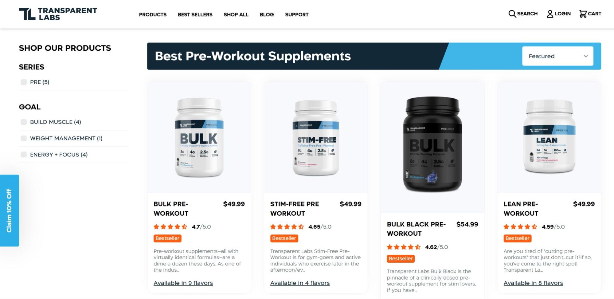
A great example of this done right is Transparent Labs, a natural sports nutrition supplement brand. For example, on this category page they display star ratings and the number of reviews below each product entry.
This simple yet effective design choice creates a sense of trust across their entire product line. Shoppers can quickly scan and compare ratings while browsing, making their decision process faster and easier.
Source: transparentlabs.com
This approach is all about reducing friction in the decision-making process. Rather than forcing customers to dive into product pages to discover what others think, it brings that vital information forward in the shopping journey.
This way, visitors gain confidence in the brand’s overall quality, not just in individual products, and move through the conversion funnel with fewer hesitations and doubts.
2. Infuse your website header with trust signals
Your website header is prime real estate for building instant credibility. This area can appear on every page and forms visitors’ first impressions.
Smart businesses use this space strategically to establish trust from the moment someone lands on their site.
Here’s how to transform your header into a trust-building powerhouse:
- Start with a clear, benefit-driven value proposition. Your header should immediately communicate what you offer and why it matters. Be specific. Instead of something vague like “Quality Service, Great Results,” highlight a concrete benefit, whether it’s cost savings, efficiency, or expertise.
- Trust badges also make a huge difference. If you have industry certifications, security seals, or recognizable brand partnerships, place them in your header or just below it. This is especially important for businesses in finance, healthcare, and ecommerce, where security and legitimacy are top concerns.
- For ecommerce brands, displaying a free shipping or money-back guarantee message in the header can help reduce hesitation. Buyers are more likely to complete a purchase when they know they have a safety net.
- If you serve businesses or high-ticket clients, include social proof like the number of customers you’ve helped, total revenue saved, or notable companies that use your service. A simple line like “Trusted by 10,000+ businesses” can make a big impact.
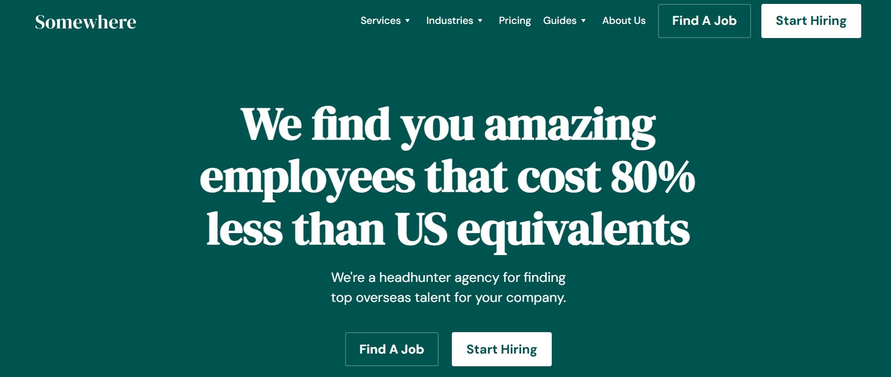
Somewhere, a platform for connecting businesses with remote international talent, demonstrates this perfectly. Their header prominently displays their value proposition: “We find you amazing employees that cost 80% less than US equivalents.”
This is not a case of vague marketing speak. It’s a specific, measurable promise (80% cost reduction) that speaks directly to their B2B clients’ primary concern.
Source: somewhere.com
What makes this approach so effective is how it instantly communicates both understanding and capability. It creates immediate confidence in the brand’s expertise.
The precision of “80% less” also suggests data-driven operations rather than empty promises, which further reinforces trust in the early seconds of the visitor experience (exactly when conversion pathways begin forming).
3. Ensure testimonials are relatable
Bland, generic testimonials don’t convince anyone. In fact, they can backfire, making your brand seem impersonal or even untrustworthy. But when done right, testimonials are incredibly powerful.
For instance, almost everyone trusts recommendations from friends or peers. The key is to make them relatable, authentic, and specific.
Here’s how to create testimonials that actually build trust:
- First, ensure your testimonials come from real people, and whenever possible, include their full name, photo, and even job title if relevant. Seeing a face makes the review instantly more trustworthy.
- More importantly, testimonials should focus on specific experiences and results. Instead of a generic “This course was great,” a strong testimonial might say: “Before taking this course, I struggled with public speaking. Now, I can speak to big audiences, and my confidence has skyrocketed.” This kind of detail makes testimonials relatable and convincing.
- Another great tactic is to highlight diverse customer experiences. If you serve different types of users (such as beginners, professionals, or small business owners), include testimonials that reflect those varied perspectives. Potential customers are far more likely to relate if they see someone with a similar background benefiting from your product or service.
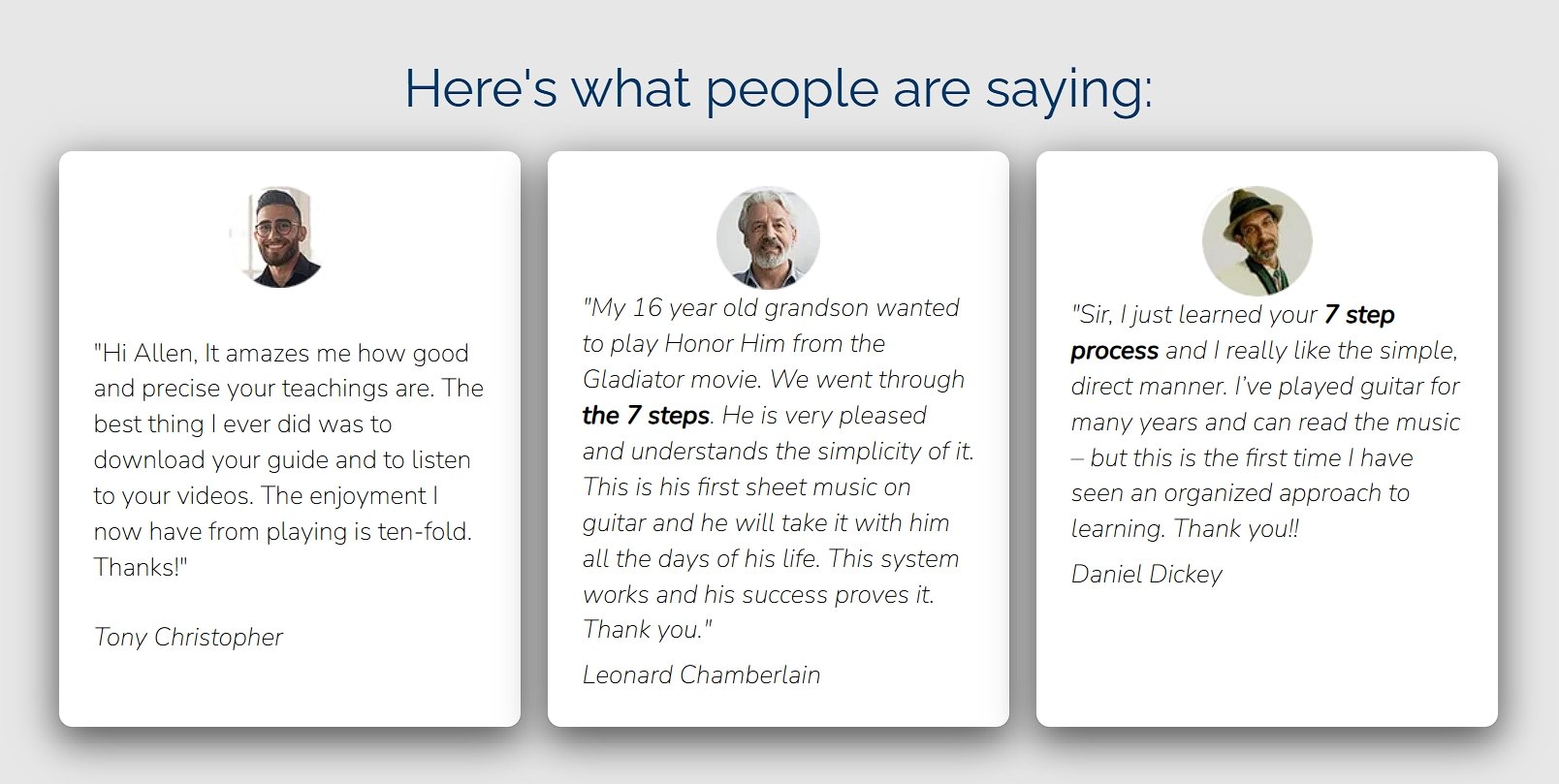
Classical Guitar Shed, an online platform offering guitar lessons and courses, nails this approach. Their homepage features testimonials with real photos and full names of actual customers.
Instead of blanket praise, these testimonials include specific details about learning challenges overcome, progress made, and the unique teaching methods that helped them succeed.
Source: classicalguitarshed.com
What makes these testimonials particularly effective is how they capture authentic voices and specific experiences. When a student mentions struggling with a particular technique for years before finally mastering it through the site’s method, other guitarists with similar challenges immediately see themselves in that story.
This creates an emotional connection far more powerful than any marketing claim.
4. Ensure your UI makes product demos easy and engaging
People trust what they can see and experience for themselves. Instead of relying on long descriptions and marketing claims, an interactive product demo allows visitors to test your offer firsthand.
This “show, don’t tell” approach builds confidence and removes doubts, making it easier for potential customers to take the next step.
Here’s how to create demo experiences that build trust and drive conversions:
- A great product demo should be accessible, intuitive, and require minimal effort from users. If people have to sign up or dig through complex instructions just to try your product, they’re likely to leave. The best approach is to offer a one-click or embedded experience that lets visitors engage with the core functionality immediately.
- For SaaS tools, consider embedding a live demo where users can input their own data and see real-time results. If that’s not feasible, interactive walkthroughs that guide visitors through key features work well. Keep instructions short and visual. Nobody wants to read a manual just to test a product.
- Another effective tactic is to showcase pre-filled examples of how the tool works. This helps users understand its value quickly, even if they don’t have their own data or scenario ready to test.
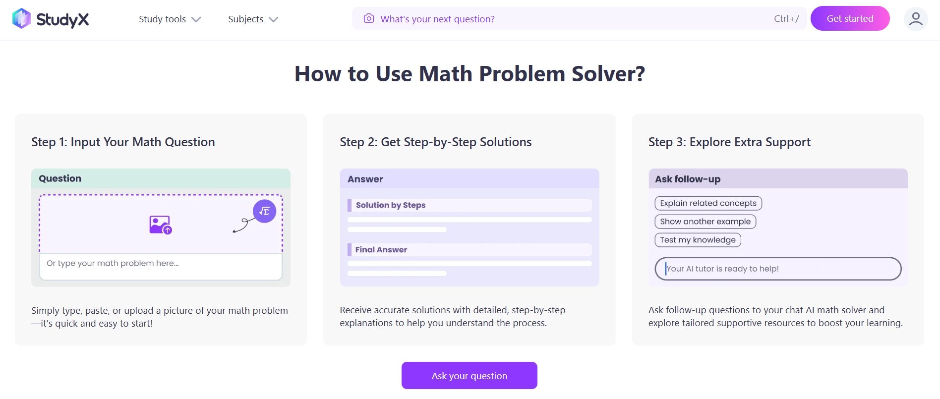
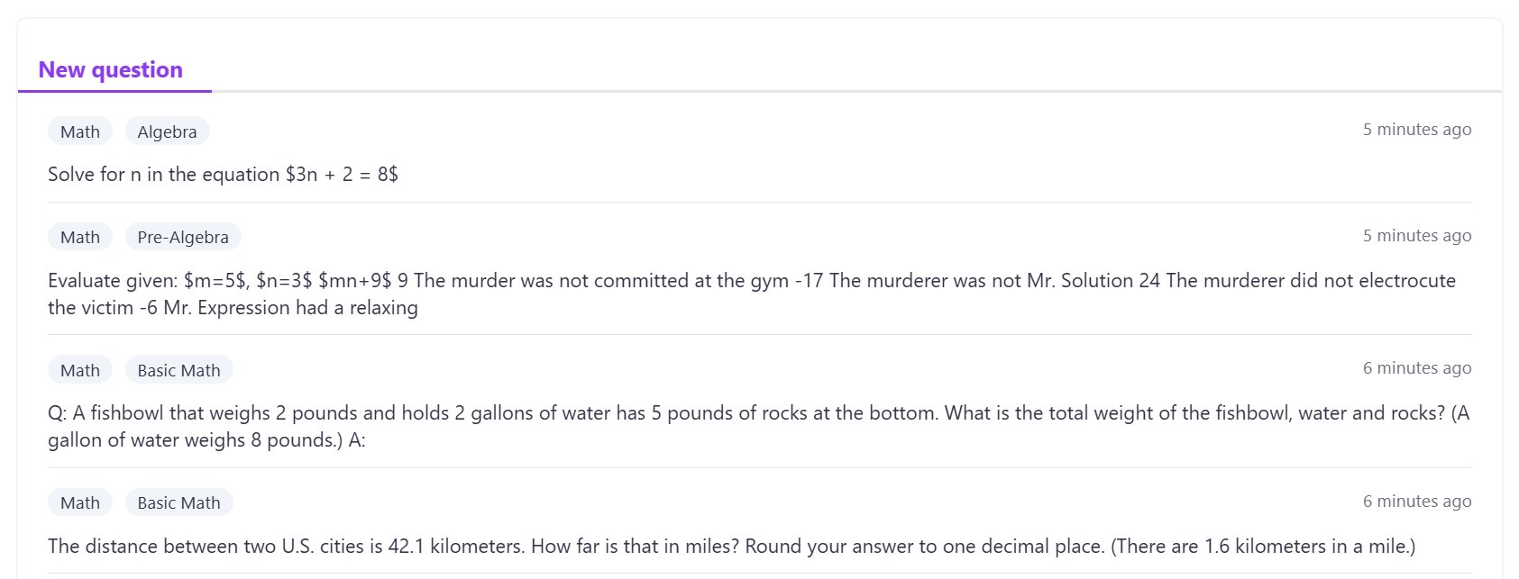
StudyX, an AI-powered homework assistance platform, executes this perfectly on their math solver & calculator tool landing page. They’ve created an interface that lets visitors immediately test the product’s core functionality by typing in their own math problems or selecting from common examples.
The experience is framed with simple three-step instructions that make it impossible to fail.
Source: studyx.ai
This method helps remove skepticism from the equation. Instead of promises about solving homework problems, StudyX lets students see actual solutions generated in real time.
They also include preselected sample questions, which ensures that even hesitant users can experience success with minimal effort.
Source: studyx.ai
This immediate demonstration of capability creates an “aha moment” where visitors instantly recognize the value.
5. Give conversion-focused blog posts the “landing page” treatment
Not all blog posts are meant for casual readers. Some attract visitors who are deep in the buying process, researching their final options. These people likely found your post through Google and have never interacted with your brand before. If your content looks like a basic blog post (just text and a few stock images), you’re missing a massive opportunity to convert them.
Here’s how to elevate your conversion-focused blog posts:
- Instead of treating these posts like typical articles, design them like landing pages. That means clear structure, engaging visuals, and trust-building elements that keep visitors on the page.
- Start with a compelling headline and subheadline that reinforces credibility. Follow this with high-quality visuals, videos, and interactive elements to grab attention. Bland walls of text won’t cut it. Break up the content with expert insights, comparison tables, tester feedback, and quick pros-and-cons lists. These additions make the post more skimmable and engaging.
- Another essential factor is social proof. Adding testimonials, ratings, and expert opinions reinforces trust. If applicable, use trust badges or guarantee seals to reassure potential buyers.
- Finally, don’t forget to add clear CTAs. If the goal is to convert, make it easy for readers to take the next step, whether it’s clicking a product link, signing up for a free trial, or making a purchase.
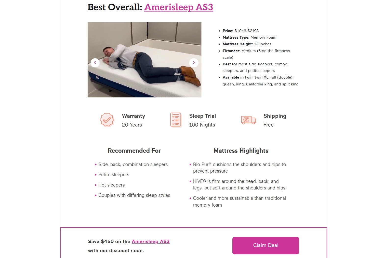
Eachnight, a comprehensive sleep improvement resource platform, demonstrates this approach with their Best Mattresses in 2025: Tested and Reviewed guide. Instead of the standard blog format, they’ve created an immersive experience that builds trust through design excellence.
Their guide includes expert video reviews, interactive comparison tools, and mattress testing footage that demonstrates product performance.
Source: eachnight.com
This strategy addresses the complete buyer journey within a single content piece. Readers can view GIF demonstrations of mattress responsiveness, read highlighted expert opinions, and access exclusive deals, all without leaving the page.
This sophisticated presentation signals authority and builds confidence in your recommendations, naturally guiding readers from information-seeking to purchase-ready.
6. Employ FOMO and urgency triggers
People hate missing out, especially when a great deal or limited-time offer is on the line. That’s why creating a sense of urgency has been shown to increase sales by 330%.
When shoppers feel that time is running out or that a product is in high demand, they’re far more likely to act quickly instead of delaying or second-guessing their decision.
Here’s how to implement urgency and FOMO effectively:
- Urgency triggers work best when they feel natural, not manipulative. The key is to provide genuine scarcity or time-sensitive offers that make people want to act.
- One of the most effective ways to do this is by displaying stock levels on product pages. Seeing “Only 2 left in stock” next to a high-demand item pushes shoppers to buy before it’s gone. Similarly, showing how many people are viewing the item in real time can reinforce FOMO.
- Time-based offers also work well. Flash sales, limited-time discounts, and countdown timers create a real deadline that motivates buyers. Just make sure these aren’t overused. If everything is always “ending soon,” people stop believing it.
- Even subtle urgency in your CTA buttons can make a difference. Instead of a generic “Add to Cart,” a phrase like “Get Yours Before It’s Gone” adds a small psychological nudge.
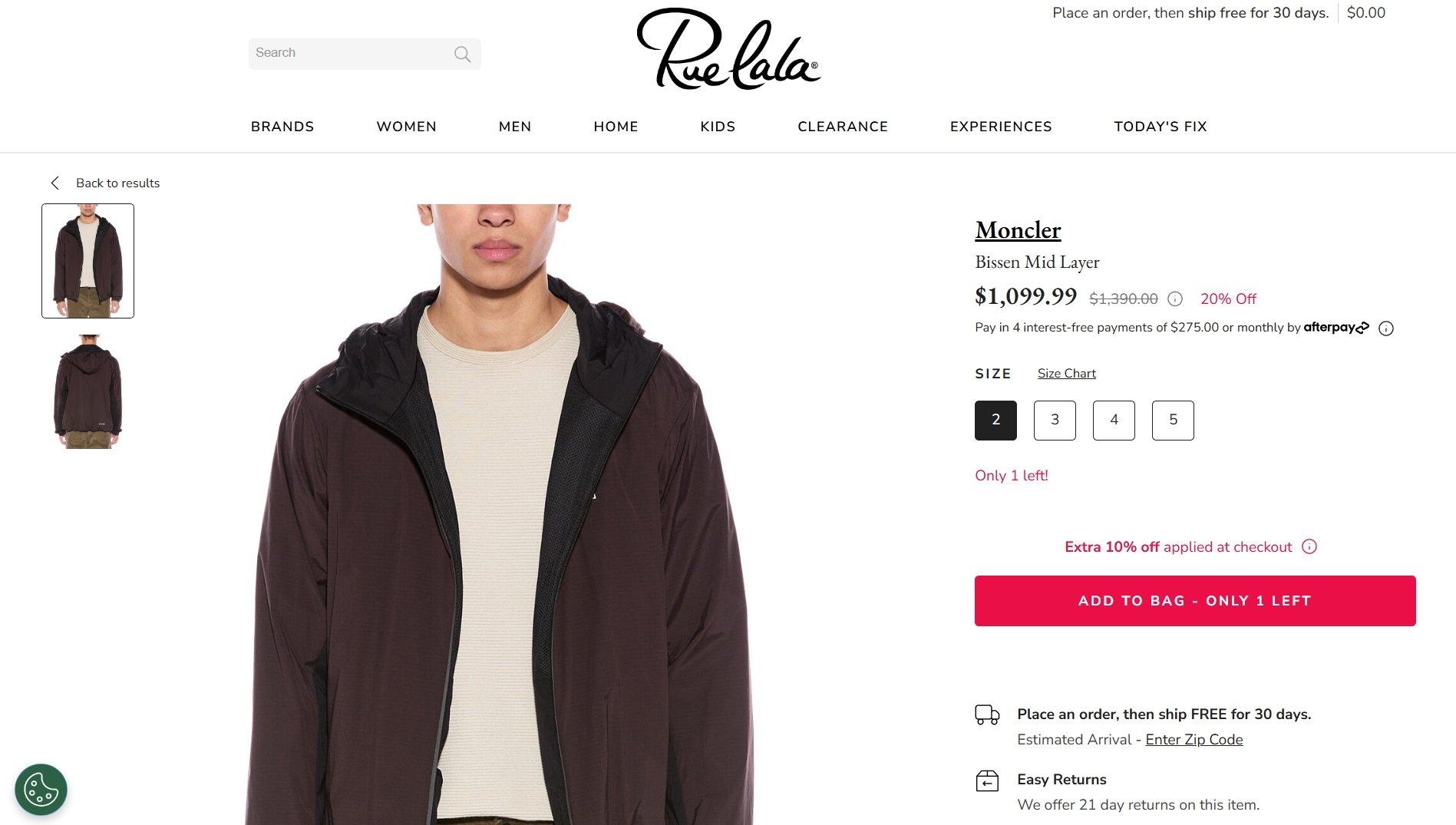
A great example of this tactic is Rue La La, a curated luxury fashion and home goods retailer. Let’s take their Moncler jacket product page.
On this page, shoppers encounter multiple trust-building urgency signals. The highlight is on a limited-time 20% discount while dynamically updating inventory to show only one remaining jacket in the selected size.
The CTA reinforces scarcity with subtle messaging, while additional text notes an extra 10% discount at checkout.
Source: ruelala.com
This creates a compelling reason to complete the purchase immediately rather than continuing to browse.
Final thoughts
The six strategies we’ve explored bridge the gap between what your visitors want and what your business needs. Implementing even one of these techniques can transform how potential customers perceive your brand and interact with your site.
So, what small change could you implement today that might completely transform how visitors experience your brand tomorrow?